Visualize database data with Oracle JET

I’m very interested in Oracle JET. So I followed the Hands-on Lab from OOW 2015. In this tutorial you’re going to build a Select component and a Data Visualization Chart component. In this tutorial the data for the chart component is based on static data. I want that the chart is based on data in a database.
The first thing I needed to do is determine is what I want to show in the chart. There is an extra challenge to show the data. The series(columns) for the data must exist as an array in an array as you can see in the next image:
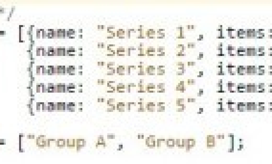
This is an example of the data shown in a chart. Per group there must be multiple series. Each serie must have an item per group.
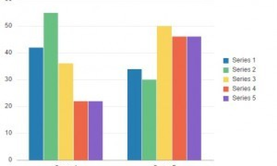
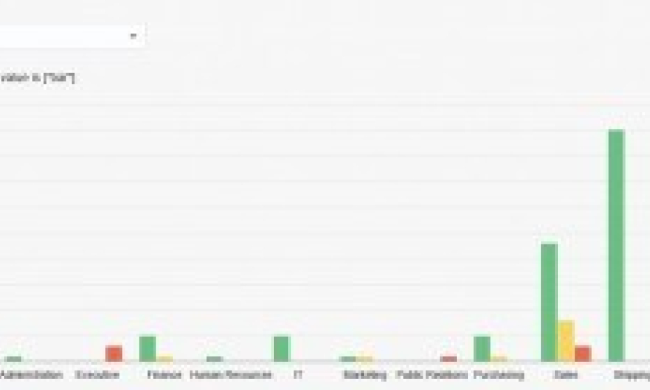
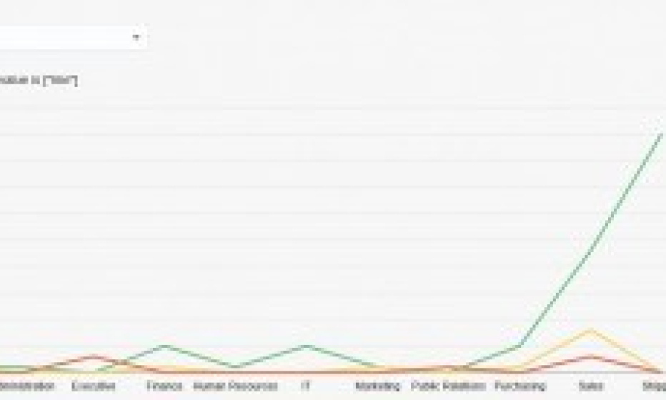
I made the following example based on the HR-schema. Per department I would like to see the number of employees that have a Low, Medium or High salary.
I created a table for this data, creating complex queries is not my specialty.
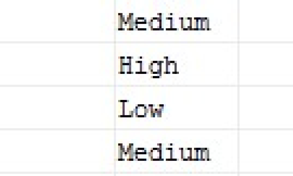
This is a part of the data in the table. Per department there are three rows; Low, Medium and High and a count of the number of employees. If the salary is lower than 10000 than the description is “Low”. If the salary is between 10000 and 15000 it is “Medium” and everything higher the description is “High”. If there is no employee for the department or for the salary-scale, then the value is 0. This is very important because otherwise the data in the array for the series doesn’t match with the corresponding group.
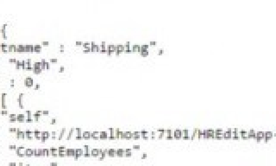
The data from the table must be exposed via a REST-service. I created an ADF web application with a view-object based on the table which I created. In this application I created a REST-service that exposes the data via the Application Module.
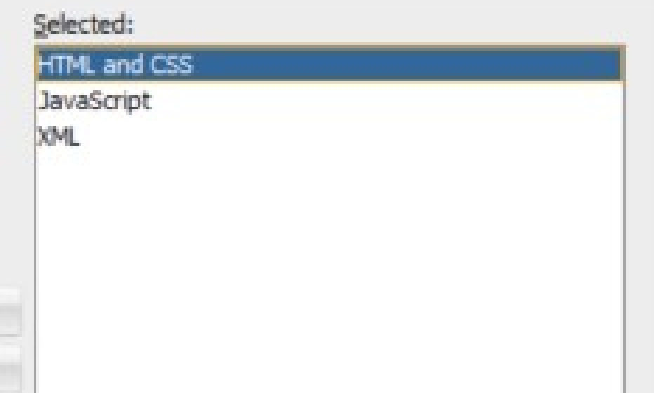
So now everything is setup, let’s start with Oracle JET. I use JDeveloper 12.2 for developing applications. For this let’s create a custom application. You must select the HTML and CSS. Automatically other depend features are added.
How an application further is created, see the Oracle JET developer guide.
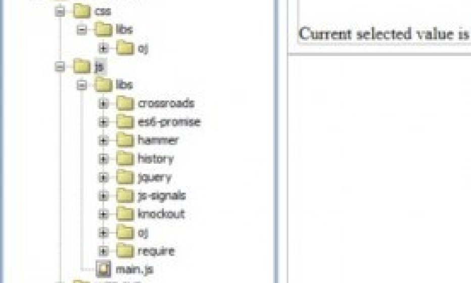
This is the project overview after creating the hands-on-lab as referenced in [1].
So my first challenge was to find out how to import the data from the REST-service.
I use the jQuery.ajax() method for this:
$.ajax({
  type: "GET",
  url: "<REST-URL",
  async: false,
  beforeSend: function(x) {
    if(x && x.overrideMimeType) {
      x.overrideMimeType("application/j-son;charset=UTF-8");
    }
  },
  dataType: "json",
  success: function(data){
    processData(data);
  }
});
This call returns the data in the parameter data in “success: function(data)” at the end.
I pass the data parameter to the function processData.
The data is accessible as an array, for example: data.items[1].Salary.
In the function processData I create first the array for the groups. In the data every Departmentname has three occurrences.
These values must be unique. With an example I found on the internet this is the code for creating the groups:
function UniqueValues(arr) {
arr.sort();
var last_i;
for (var i=0;i<arr.length;i++)
if ((last_i = arr.lastIndexOf(arr[i])) !== i)
arr.splice(i+1, last_i-i);
return arr;
}
for (var x=0;x<data.items.length;x++){
arr.push(data.items[x].Departmentname);
}
barGroups = UniqueValues( arr );
So now the parameter “self.barGroupsValue” can be filled with: self.barGroupsValue = ko.observableArray(barGroups);
The parameter “self.barSeriesValue” will be filled from the function bardata.
self.barSeriesValue = ko.observableArray(bardata[“series”]); I based this function on the function “GenerateRandomCountData” from the example in the API documentation for ojChart.
This is the main part of the function:
for (var g = 0; g < DepartmentGroups.length; g++) {
for (x = 0;x < chartdata.items.length;x++) {
if ( String(chartdata.items[x].Departmentname)==String(DepartmentGroups[g]) ) {
if (String(chartdata.items[x].Salary) == 'Low')
{ var EmpValue = String(chartdata.items[x].Employee);
seriesdata['series'][0]['items'].push(EmpValue);
}
if (String(chartdata.items[x].Salary) == 'Medium')
{  var EmpValue = String(chartdata.items[x].Employee);
seriesdata['series'][1]['items'].push(EmpValue);
}
if (String(chartdata.items[x].Salary) == 'High')
{  var EmpValue = String(chartdata.items[x].Employee);
seriesdata['series'][2]['items'].push(EmpValue);
}
}
} // for x
}  // for g
Now the bargroups and barseries are filled with the data. Let’s run!
Another view:
My opinion about Oracle JET is that it has a steep learning curve, but it is very interesting.
Links:- Hands-on Lab presented during OOW 2015
- Oracle JET Developer Guide
- Oracle JET API documentation, Chart – Correlated Charts
